Last night I uploaded the new look to LizzieAndrewBorden.com. I hope you all like it. I decided I was not only bored with the old layout/look, but that the site needed a classier more modern look. It took about four days to do, but I am rather pleased with the result.
If any parts don't work, please use this thread to let me know and I will fix the problems when and if they arise.
Did not work at all for me, but I am on AOL, you know we have had problems before. None of the tabs take me anywhere?????????? It just stays on the main site page.
"I'd luv to kiss ya, but I just washed my hair"
Bette Davis
Works fine, but I like the old one better. Oh well, I'll get used to it.
A man ... wants to give his wife ... the interest in a little homestead where her sister lives. How wicked to have found fault with it. How petty to have found fault with it. (Hosea Knowlton in his closing argument.)
Good job Stef, It looks great. It must have taken you awhile to do it. I still can't get a card to go through here for someones birthday!!!!! so I can't imagine doing a whole website.
It worked fine for me. The new look is very different from the old look, and it is definitely something I'm going to need to used to; although, I did find it easier to read - that is the black lettering on a white background is easier to read than the white lettering on a black background. However, the white lettering on a black background is much more mysterious, which, as we all know, is what the Borden case is full of. Guess that is what I liked about the old look. I think in time, we'll get used to the new look. Good job, Stefani!
In remembrance of my beloved son: "Vaya Con Dios" (Spanish for: "Go with God"), by Anne Murray ( https://tinyurl.com/y8nvqqx9 ) “God has you in heaven, but I have you in my heart.” ~ TobyMac (https://tinyurl.com/rakc5nd )
Beautiful job, Stefani! Your hard work paid off. I think it's probably going to be easier to use.
All of the titles of the different places on the site don't appear at once, tho. I did like that about the other one.
I did love the other one. I enjoyed all the different colored Lizzies. And especially how you had the name of the website 'appear'.
This is quite a change, from the 'most colorful' to 'muted'. It might be an idea for the future, to maybe put a little Victorian decoration on the page somewhere, somehow.
But this is just first impression. I may love this new one, too, in a month or so.
The background is a little bleak, maybe you could put different dress patterns in the background? I really liked the "Andy Warhol" type theme in your last change, this one needs a little tweeking I think?
"I'd luv to kiss ya, but I just washed my hair"
Bette Davis
I like the new look and it seemed to work fine when I wandered around. Although the former look was great too, it's nice to have a change once in awhile. Whatever the appearance - the site is a wonderful resource for all things Borden!
Really, I don't know - I am away so much myself.... L.A. Borden
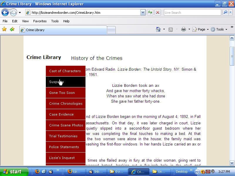
I'm having a problem with it. The red rectangular whatchamacallit that lists the various pages to click (How's that for technical language?) overlaps left part of the text on each page.
For example on the first "Crime Library" page, the first five or six characters of the left side of the text are covered by that index block thingy all the way down to "When her elderly father. . ."
I first viewed it using the standard aol browser, then I switched over to Windows Internet Explorer and it was the same.
So, I guess I liked the old style better.
I've met Kat and Harry and Stef, oh my!
(And Diana, Richard, nbcatlover, Doug Parkhurst and Marilou, Shelley, "Cemetery" Jeff, Nadzieja, kfactor, Barbara, JoAnne, Michael, Katrina and my 255 character limit is up.)
FairhavenGuy, perhaps your computer screen is small? Can you adjust the size of your browser's viewing window? By dragging the lower right hand corner to the right and down to fill your screen? Or enlarging the screen itself by toggling the windows buttons on the upper right? Would you, for me, try this and see if now everything is in place?
I tested the site on various browsers and it appeared to work fine on Firefox, Safari, Opera, but don't have IE. Maybe Harry would test that one for me?
What Harry's screen shot showed is exactly what I got.
Both at work and at home on two different size screens.
My screen was plenty wide enough to hold the full image, it was just that the index block was out of place.
Guess I gotta start using a different browser.
I've met Kat and Harry and Stef, oh my!
(And Diana, Richard, nbcatlover, Doug Parkhurst and Marilou, Shelley, "Cemetery" Jeff, Nadzieja, kfactor, Barbara, JoAnne, Michael, Katrina and my 255 character limit is up.)
I've met Kat and Harry and Stef, oh my!
(And Diana, Richard, nbcatlover, Doug Parkhurst and Marilou, Shelley, "Cemetery" Jeff, Nadzieja, kfactor, Barbara, JoAnne, Michael, Katrina and my 255 character limit is up.)